A quick guide to readable game text
At GDC Summer, EA Sports' Karen Stevens shared the importance of legible fonts and why you shouldn't write off Comic Sans

For a medium that's so focused on visuals, video games ask people to do a surprising amount of reading.
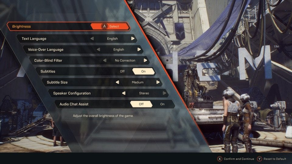
Players are often faced with menus, inventory screens, item descriptions, text prompts, dialogue trees, skill trees, labelled maps, subtitles, objectives and other text-centric HUD elements -- the list goes on.
With no way to be certain of a player's screen size, the distance between them and the screen, or their quality of vision and reading ability, it's vital that developers think carefully about the fonts in which they present these text elements
That was a central message from EA Sports' accessibility lead Karen Stevens during her GDC Summer talk, entitled 'Accessibility Best Practices: In-Game Communication.' The presentation offered advice on how to ensure accessibility across everything from menu navigation to text and voice chat between players, but it began and ended with a focus on readability.
In this article, we share her recommendations for best practices when it comes to in-game text.
How big should your text be?
"If no one can read your text, it may as well as not exist. None of us are saying, 'Let's make games people can't play'"
Stevens recommends that all texts are a minimum of 28 pixels tall by three pixels wide when viewed on a 1080p screen -- metrics she has defined after a wide variety of user research.
"That may seem rather big, but if you look at the television industry, their minimum font size recommendation on things like captions is actually 80 pixels tall in this scenario," she adds. "So 28 pixels isn't really that big."
It's also recommended that players be given the option to resize the text -- although Stevens emphasises this is "not a pass to have a super tiny font to begin with." Games can have fonts that go larger or smaller than the minimum she recommends, but it's crucial that the latter is not the default.
Subtitles are perhaps the only text element where there should be an upper limit; you ought not to have captions that cover the entire screen. However, for all other in-game text, Stevens says there is no maximum size.
"If you make an 'OK' button that fills the entire screen, technically speaking that's absolutely fine," she says.
A note on contrast
Stevens also recommends that the contrast ratio should be 4.5:1. This is to ensure enough contrast between the text and the background so that it stands out, giving the player the best chance to see it.
If you're unsure of the contrast ratio for the text in your games, Stevens recommends the online tool at Constrast-ratio.com.
Which fonts should you use?
"Comic Sans tends to get a bad reputation but really it's a very good font - particularly for dyslexia"
Stevens suggested that developers use sans serif fonts -- i.e. those without flourishes at the ends of each character -- to maximise readability. These should be used not only for every menu, but all other forms of in-game communication to ensure players can parse every text element they encounter.
Stevens recommends fonts such as Arial, Helvetica, Verdana and Comic Sans. Yes, Comic Sans.
"Comic Sans tends to get a bad reputation but really it's a very, very good font," she says. "Particularly for dyslexia. Those with dyslexia have trouble distinguishing different characters and the way Comic Sans is is much easier for them -- more so than most actual fonts made for dyslexia."
Choice of font is of utmost importance, according to Stevens, who points out that other industries -- including the defence industry -- will use these for long and important documents simply because they are easier to read.
That's not to say you must never use a serif font, of course.
"It is okay to have alternative fonts," says Stevens. "If you have a fancy font that fits your game style, it's okay to do that but it's highly recommended to have an option to turn that off. I see more and more games do this, and that's really a great thing."
Stevens reiterated that having legible fonts is "one of the biggest issues we have for accessibility in the games industry at this time."
"If no one can read your text, it may as well as not exist," she concludes. "None of us are saying, 'Let's make games people can't play' or 'Let's make menus people can't use' so it's important to keep these things in mind."