You have five seconds: Why you need strong visual design in your indie game
Skelattack's creator David Stanley on why first impressions are everything, plus art tips so your assets stand out
It takes as few as five short seconds to make an impression. Whenever a potential player sees a trailer, screenshot or short gif of your indie game on social media, they quickly make a subconscious decision about whether or not they want to play it.
You have to make every second count by exciting the imagination of a stranger. When I started laying the groundwork for our new game Skelattack in late 2015, I was only just learning how to program, while also tackling the project's art and animation. My programming skills at the time were basic to say the least, so all I really had in my arsenal to grab someone's attention was years of art and animation experience.
Visuals is what opens the door -- when a new user passes through that door they then focus on how the game feels
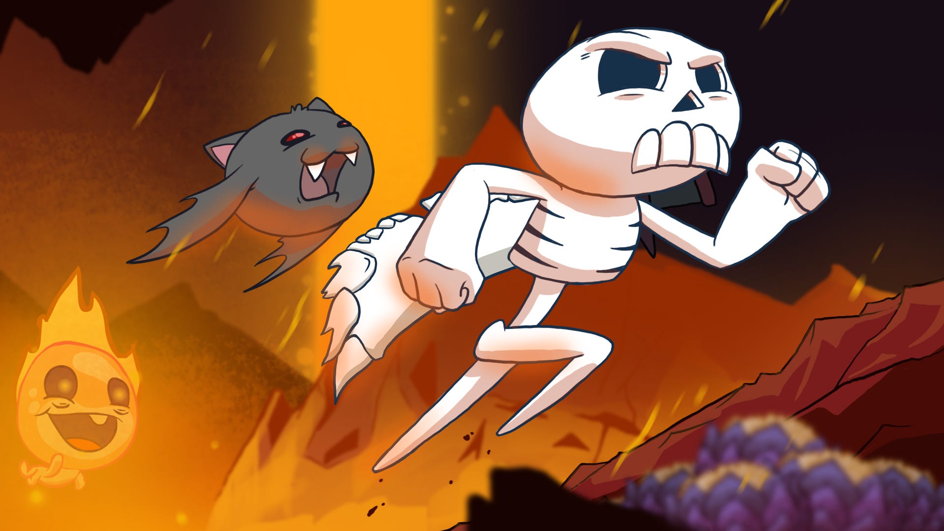
Starting the game as a one-man team, the first big decision I made was that Skelattack would be 2D. I had never worked in 3D and already felt like I was in over my head learning programming. I adored the many cartoons I grew up with -- Rocko's Modern Life, Ren & Stimpy -- and felt that a cartoony approach would be fun to work with. Vibrant characters that are a joy to animate. That was my goal.
A few years later, when I teamed up with the fine folks at Ukuza and took the game to PAX South and later PAX East in 2018, we saw very good results from an art-led approach. The eyes of parents and children alike lit up when they saw Skelattack's art style, and we found that people would visit the booth daily to play our demo.
Shows like PAX can feel like Disneyland for gamers -- you could spend days there and still not see everything -- so with that much competition you can see how important it is to make sure your first impression is a good one.
When people are discussing upcoming games, they will typically focus on the visuals first. This is what opens the door, and when a new user passes through that door they then shift their focus to how the game feels to play, and how well it has been designed.
Choose an appropriate style that plays to your strengths
Indie studios typically don't have a great deal of funding, and certainly don't have the resources of a AAA studio, so cutting-edge visuals are often out of our reach. This is the way things are, but indie developers are nothing if not resourceful.
As a developer I've always pushed back against adopting a particular style just because it's popular in the moment. At high school my friends and I were into Dragonball Z and anime in general, and we all tried to copy that style in everything we were drawing. We had no idea what we were doing, we just emulated something that was wildly popular. As such there wasn't a real passion behind the art like there would be something of my own design. It's cringey to look back on, but a valuable experience for me as it's how learned it's better to nurture your own style than follow the crowd.
I've always pushed back against adopting a particular style just because it's popular in the moment
When trying to nail down a game's visual style, it needs to be something that excites you personally. If you're in this for the long haul, bringing your finished game to market could well mean needing to work with this visual style for months or even years, so it better be a style you're invested in.
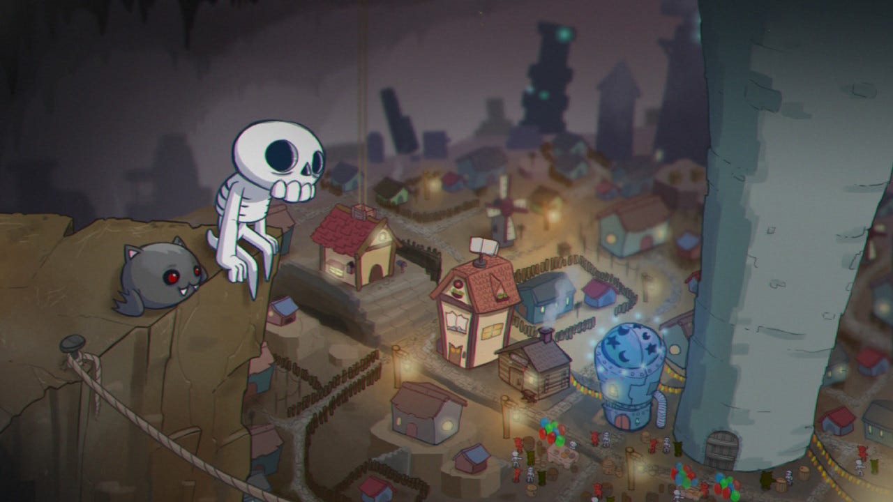
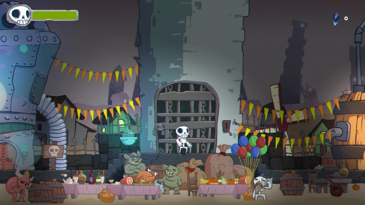
On Skelattack we found that, even within the 2D and pixel art fields, there was so much room for innovation and growth. This is where many indie developers can play on simple nostalgia to help grow an audience. Skelattack is in many ways a tribute to the silly and quirky hand-animated Saturday morning cartoons and challenging platformers of my childhood. Our goal was to create imaginative settings and characters that possess so much charm you can't help but smile.
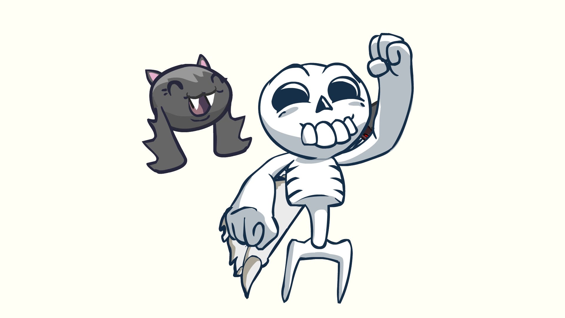
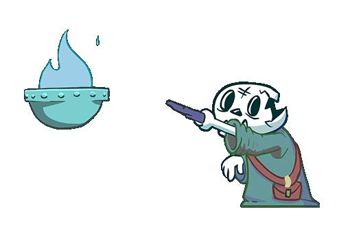
When you look at logos for popular brands like those of Apple, Pepsi and Nike, they have a recognisable simplicity that is instantly appealing. This is something I directly applied to the design of Skully, Skelattack's lead character. It's a simple design and looks modern -- at least as far as skeletons are concerned -- but when you see him, you instantly know what he is supposed to be without us needing to add a ton of detail.
This approach to our main character and the rules behind the visual choices we made -- simplicity, vibrance, personality and cartoony fun -- trickled down through the rest of the project. Imber the bat, Skully's pal throughout the game, was designed a bit later and followed those same rules.
Avoiding a short shelf-life for your game
One of the many issues faced by indies is how to maintain relevance at a time when almost everyone is building their own game. Very early in Skelattack's life, I settled on a simple set of rules:
- Rule 1: No pop culture references. Skelattack exists somewhere in the distant past, but not our past
- Rule 2: See Rule 1
When this connection to the real world is broken, it gives you freedom for interesting visual storytelling. What do the people of this world care about? What do they laugh about? What do they fear? These are all things that can be referenced without a word, through your visuals. You create the rules of the world, and this can flow down into every aspect of design, even something as simple as the building materials they use for their houses.
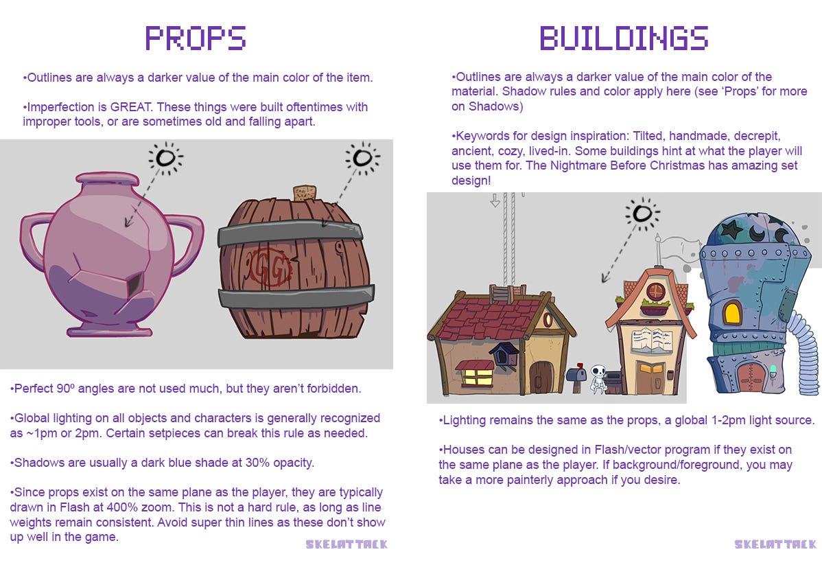
I created a very simple style guide for the art team to follow as they designed props, characters and buildings (see below). Everything from global lighting to how to create the outlines for certain materials was laid out for the team. When creating assets, it's absolutely crucial that these pieces actually look like they belong in the same scene. If artists have competing color ideas, varying line widths, and incorrect lighting information, the cohesion of the scene is destroyed, and the shelf-life of your project decreases.
A strong visual style will help inform development choices later
Imagine you're playing Super Mario 64, running around the courtyard of Princess Peach's Castle, when suddenly an armor-clad space marine appears, shooting his plasma rifle into the sky.
It's just wrong isn't it? This new character's design and choice of weapon make no sense in the game world in which he appears. The space marine doesn't speak the same visual language as the setting and other characters, and this can break the visual design of entire games.
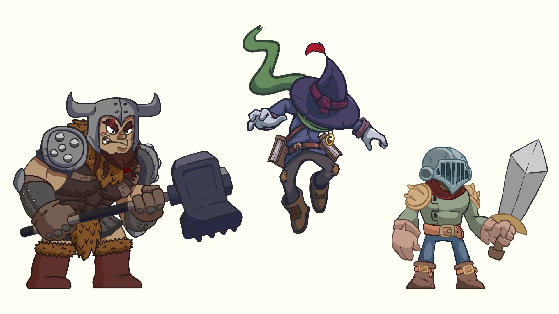
Skelattack, for example, might take place in a fantasy world, but it has strict rules. Our team understands the general era in which the game exists, the types of creatures that can inhabit the dungeon, what the architecture should look like, and the types of enemies that are allowed to exist. Each of these things serve the plot, and the plot would begin to fall apart if these rules were not followed.
The team had many long meetings and brainstorming sessions about the kinds of enemies we'd add to the game for Skully to fight. We ultimately agreed that all major enemies and bosses should be human to support the narrative we decided to tell. They would be our quirky take on some common archetypes of the fantasy genre: wizards, knights, heavy brawlers and so on. These designs fit into what has already been established by the game world.
Once this foundation of solid visual design has been established during development, the game begins to tell you what is acceptable instead of the other way around.
People respond to assets created with love
Something I've talked about since my earliest days in game development is the importance of swaying grass. A small prop that many games have, but how many times do you look at a game scene and see no movement at all? It communicates a lifeless environment but adding a simple swaying animation changes a scene entirely.
This applies to many things: the flickering of an old light bulb, a spinning gear on a machine, the movement of the leaves in the trees, the splashing of water spilling out of a sewer pipe. When you imbue even as simple an asset as a patch of grass with life, it helps create the kind of brilliant and beautiful game worlds we fondly remember.
We used this technique frequently on Skelattack. When designing props for a new area, we kept in mind how these objects may act in the real world and animated accordingly. For example, in many areas of the game an ancient dust falls from the ceiling. I created a single sprite and we populated the dust object in the room with random positions, directions and speed. Chimneys will spew out thick clouds of smoke that are handled by an automated script for size, opacity and rotation.
In such a crowded indie market, things like this are a time investment into your own future as a game developer. This also circles back to my earlier point about choosing a style that you are passionate about, because when you love your work it doesn't feel like work at all.
David Stanley is the creator and art director for Konami's Skelattack, which initially was his solo pet project before joining forces with the Ukuza team in 2018. Prior to that, David worked as a freelance designer, primarily doing art, animation and level/puzzle design for indie mobile games, all while working on Skelattack.
Skelattack is the first title to be published by Konami's external publishing programme. Read more about it and how the partnership came about on this page.