The Abstraction rebrand: How we did it
The studios reveals the in-depth process it went through when determining its new brand identity
The world around us is constantly evolving. And if you want to stay relevant as an organization, your brand must too. Especially in a fast-paced market such as ours, moments of reinvention and growth ask for an unbiased overhaul. So that's what we did. Say hello to the new Abstraction.
ARK: Survival Evolved, The King of Fighters XIV, Hotline Miami, Angry Birds, Deadlight, Broforce: a few of the projects that we worked on. We are best known for our ability to accurately and faithfully port titles across multiple core platforms. No compromises, just cutting-edge results.
We have been doing these types of adaptations for 11 years now and it has been a blast. It still is. But along the way, we learned that it has become part of a much wider variety of areas that we're in. We have finally committed a dedicated team into developing our very own, bespoke game project, for instance.
So today we are entering a new chapter and not just for the sake of change. Our branding no longer represented who we are, what we do and how we make a difference. And with the organization expanding, that's a huge red flag. We were in need of true and honest introspection. And preferably, as quickly as possible.
Not too much later and as fate would have it, we were approached by a Branding & Digital Agency called Stuurmen. Its 'kill off the average' belief is what somehow triggered our interest. Skip ahead a few days and there we are, having a cold one at our weekly 'Friday Drinks'. Discussing possible approaches, collaborative processes and an overall partnership.
"Our branding no longer represented who we are, what we do and how we make a difference. And with the organization expanding, that's a huge red flag"
A logo is not a brand. A brand is everything and everything is a brand. It's the sum of all interaction that constitutes a brand's emotional experience. It's how you behave, the way you speak, how your people represent it, and so on. It's the reason you choose the blue or the red labeled coke.
For us, there were three major challenges within the branding process:
1. Getting our internal branding on point
2. Build a unique, coherent and layered brand identity
3. Create a solid foundation for all future marketing activities
For all of these challenges to be tackled, it was of utter importance to embrace an inside-out approach. Expose our DNA right down to the hair follicles. Because only when we know who we are can we become what we want.
We did this through a series of exercises. Including:
1. Safari
The exercise kicking off this process was called a 'Safari'. Well, exercise... We just did what we always do on a Monday, but we got 'shadowed' doing so. It turned out to be a method of observing in order to map out distinct Habits, Activities, Space, Likes and Dislikes within the organization. The reason for this was that there could be some gems in there, which are part of what makes Abstraction authentic and real.
2. The Sessions
After the 'Safari' we went ahead and did an inside-out creative session. Which was based around exploring the emotional core of the organization, its people, ambitions and values.
3. The Golden Circle
For example, we applied Simon Sinek's acclaimed theory: The Golden Circle. Sinek claims that the difference between inspiring and uninspiring organizations is in the order of communication. Where uninspiring organizations communicate from the outside in, inspiring organizations do the exact opposite. Doing this exercise unveiled some interesting - but most of all - surprising stuff about the way we do things here at Abstraction. And that's odd because we are Abstraction.
4. Brand Deck
Another interesting exercise was called the 'Brand Deck'. We used it to identify the core ideas we believe in and what characteristics we want to be recognized for by our audience.
The deck consists of individual cards with an adjective on both the front and the back. These adjectives are always in contradistinction to each other. Together we sorted these cards into different piles ('We are', 'We are not' and 'Does not apply'). But here is the catch: once all the cards had been sorted, we had to narrow it down to a maximum of only 6 cards. These would be our brand's characteristics. These characteristics turn our vision into a mission because once we say them out loud, we have to act accordingly.
These characteristics are:
Bold
We take a stand. Not everyone will agree with everything we say, and that's ok. We take our position and back it up. We are not afraid to tell people that we are good. Of course, we do not want to be seen as arrogant, but we are not afraid to show ourselves.
We have our own point of view, but we will not belittle competitors or those who do not share it. We recognize when we fail, acknowledge it and learn from of it.
Boutique
We operate as a small shop or a small specialty department within a larger store. An exclusive business offering a customized service.
We are characterized by our tight-knit atmosphere and idiosyncratic style. We are the idealist, the complex one, and that is where a 'boutique' touch belongs.
Casual
We are professional to the outside world, but of course, we also have our 'casual' side. Let's face it, we are one big family that really cares for one another. We use a friendly tone that is not overly formal. We do not use buzzwords and we give everyone the opportunity to express themselves authentically.
Clear-sighted
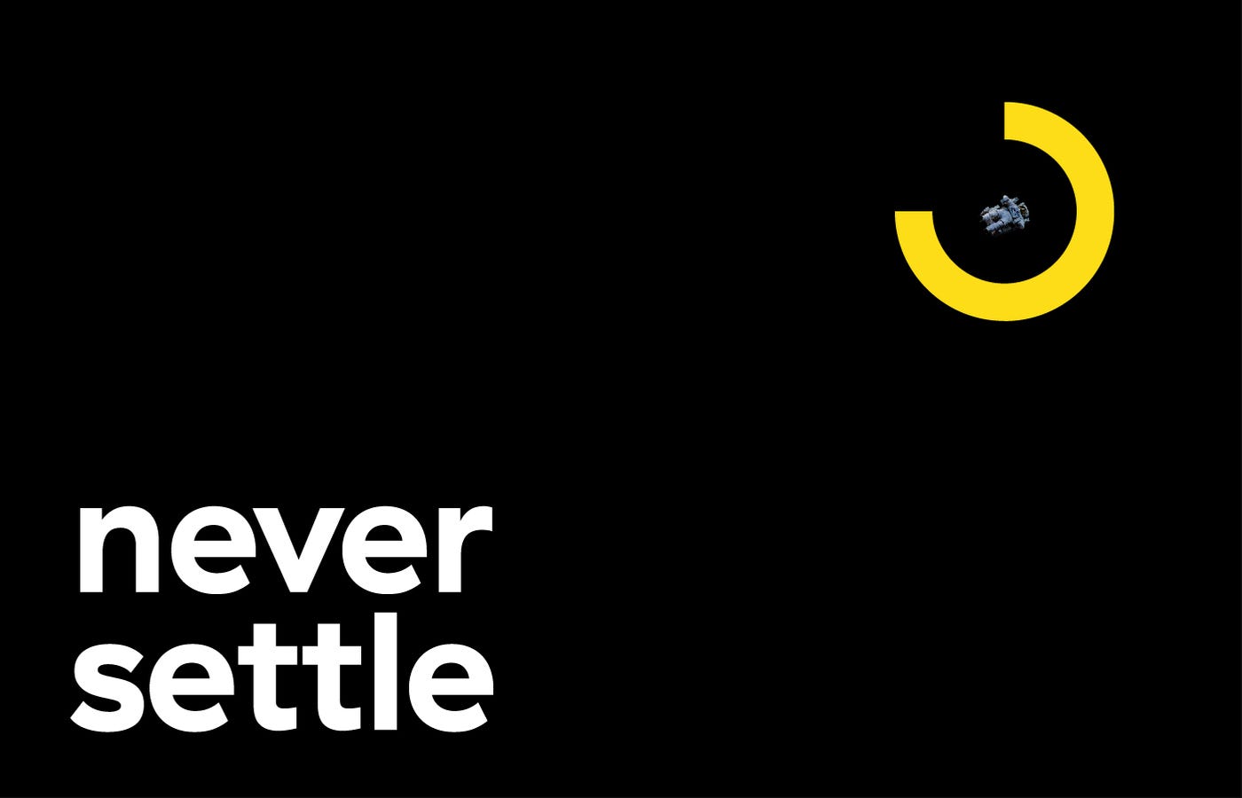
We never settle. We do not mind going that extra mile, as long as it is for the sake of quality. For instance, if we create an adaptation, it's never just a copy. We enhance the game where possible, to maximize the gaming experience. From visuals to controllers: every detail matters. Not just for the sake of it, but because we simply can't not do so.
Complex
Our market is complex. That is - in the end - the reason that people end up at a specialist. We do not pretend our work to be something that we do effortlessly. It's never a cakewalk. Our work takes time, money and a lot of knowledge is needed to get the job done.
Brand Archetypes
Swiss psychiatrist and psychologist Carl Gustav Jung applied the theory of archetypes in analytical psychology in the 20th century for the first time. According to him, these archetypes are in our collective consciousness. These are instinctive remembrance images to persons who exhibit recognizable behavior, which is immediately identified by others. They stimulate automatic thoughts, associations, and patterns.
The same goes for brands. Brand archetypes provide tools on how to act and how not to act within a specific archetypal domain. People do not recognize these archetypes consciously, but instinctively. This makes people feel immediately familiar with a brand.
For us, there are two archetypes we can really identify with:
1. The Creator
The creator archetype fosters true innovation and beauty and creates something enduring that is able to influence on multiple levels. Their artistic side craves a non-conforming and imaginative perspective. This unique combination means that they feel very comfortable coming up with creative solutions to problems that others may not think of.
2. The Magician
The magician archetype involves experiencing 'magical moments' that leave one feeling mesmerized, satisfied, happy, or transformed in some way. Magicians aim to understand the way the world works.
The outcome
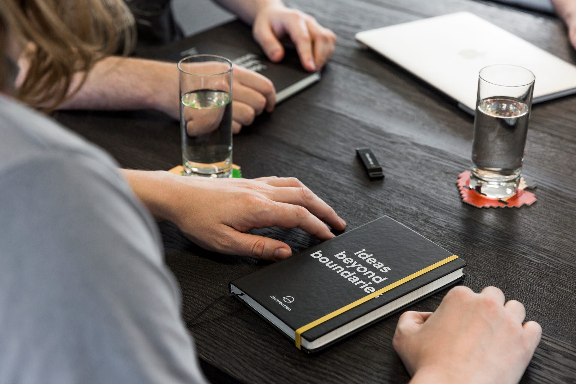
Combining conceptual thinking with sharp aesthetics, led us to the creation of a meaningful brand that has both surface and substance. We also created a comprehensive Brand Guide System, which addresses our identity's usability and perception, all while representing our core values and beliefs.
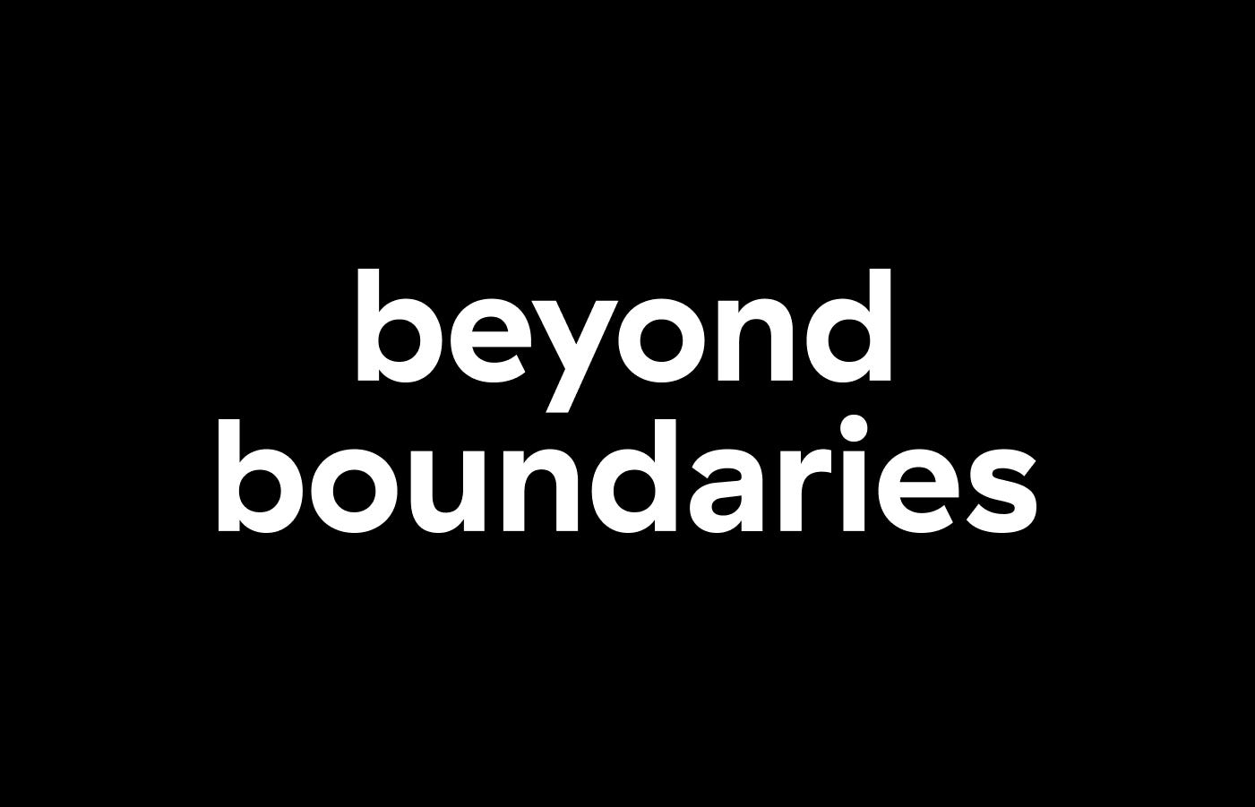
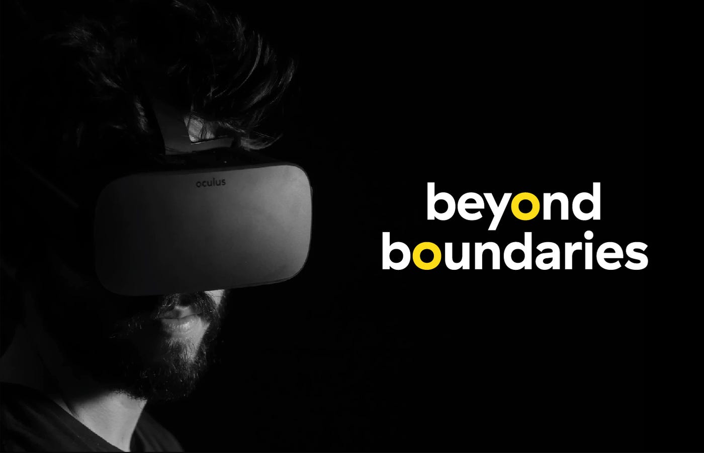
'Beyond Boundaries' is the pay-off that we're embracing. This is what typifies us. We do not shy away from a challenge. Make it hard for us, and if possible, even harder. We love taking the path less traveled, because that is where all the fun is. We'll make it happen and that's guaranteed.
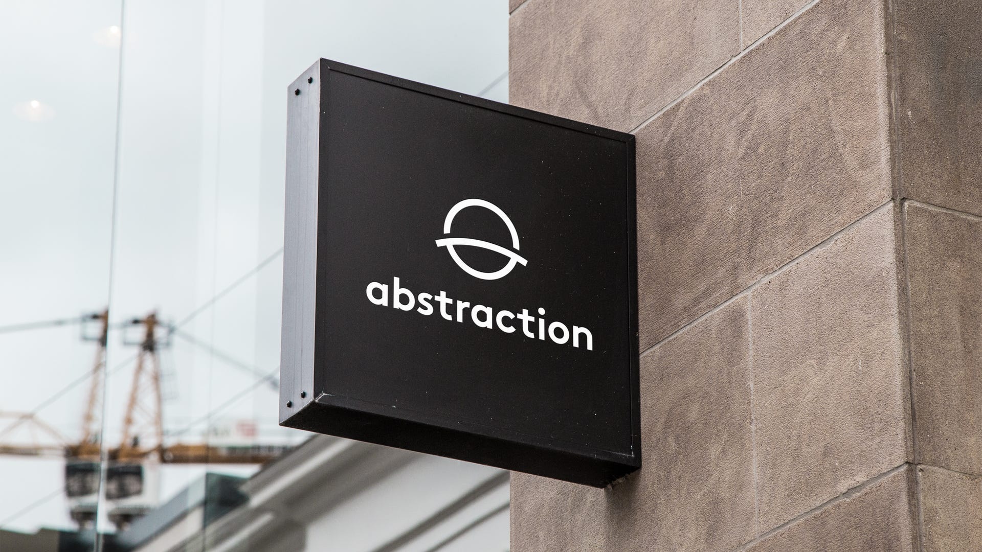
The most visual change is in the name. We have lost our tail: it's no longer Abstraction Games, just Abstraction. And as mentioned earlier, there's a clear reason for that. Game development is and always will be our core, but now there's more. Online and offline, software and hardware: we embrace it all. An 'identification name' like Abstraction Games, is simply in the way of that. We needed a more abstract (no pun intended) name that is able to accommodate different services, without being confusing or misleading.
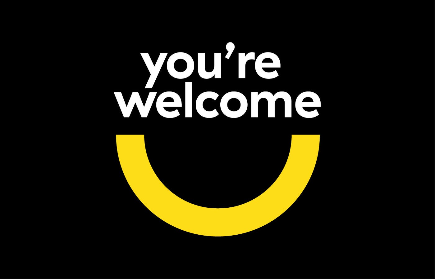
Introducing... our new logo
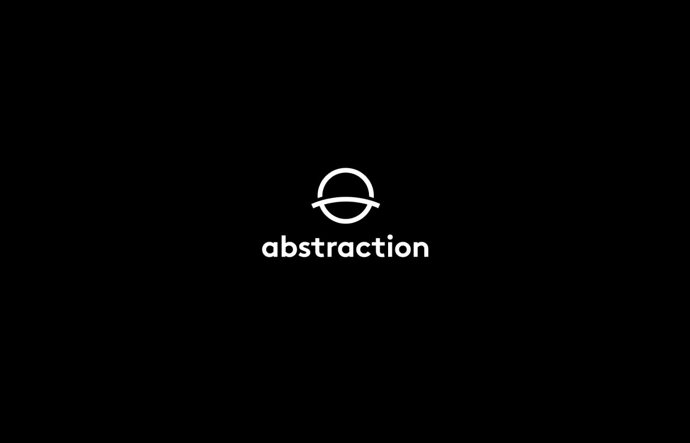
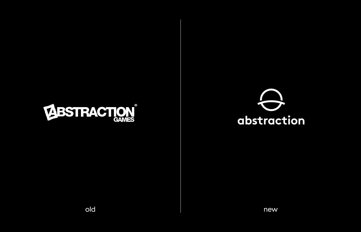
There it is, the die is cast. Behold the brand new Abstraction logo. Simple, bold and above all, balanced. The symbol is derived from two things.
1. It evokes going beyond boundaries. The planetary horizon within the symbol conveys a message of pushing limits, going beyond what is possible and never settling.
2. The reference to the old 'Abstraction Games'. The letter 'A' and the letter 'G' are used to create a perfectly balanced symbol, making the reference to where it all started for us 11 years ago. And how we have grown ever since.
These two elements combined give the symbol a message of reinvention and growth, without losing sight of our origin.
The color palette
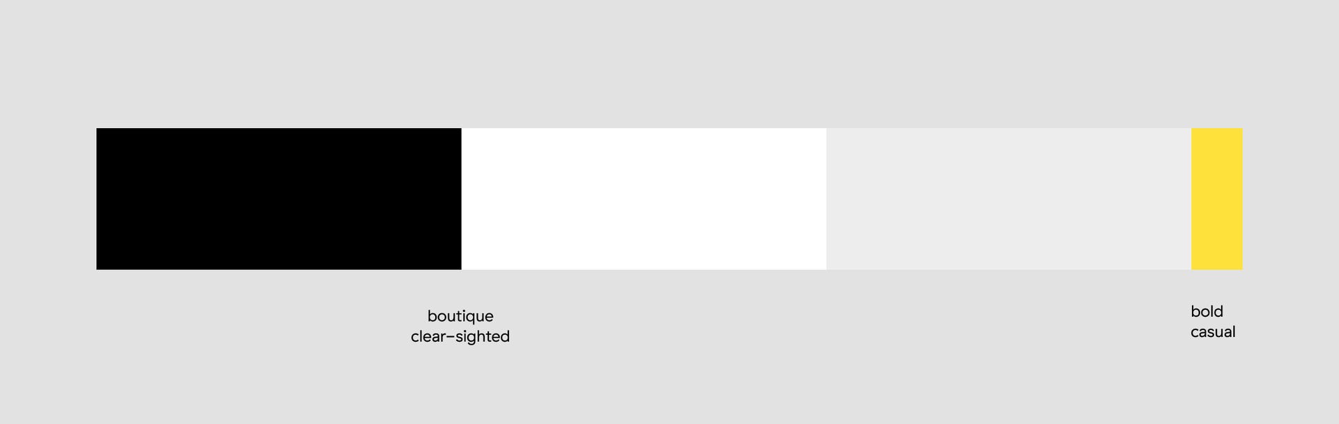
When building our color palette, we kept very close to our brand values. We use black, white and grey to convey the 'boutique' and 'clear-sighted'. We use a touch of yellow to convey 'bold' and 'casual'. We only use yellow in moderation and when it fits the message. Or when we want to make a statement.
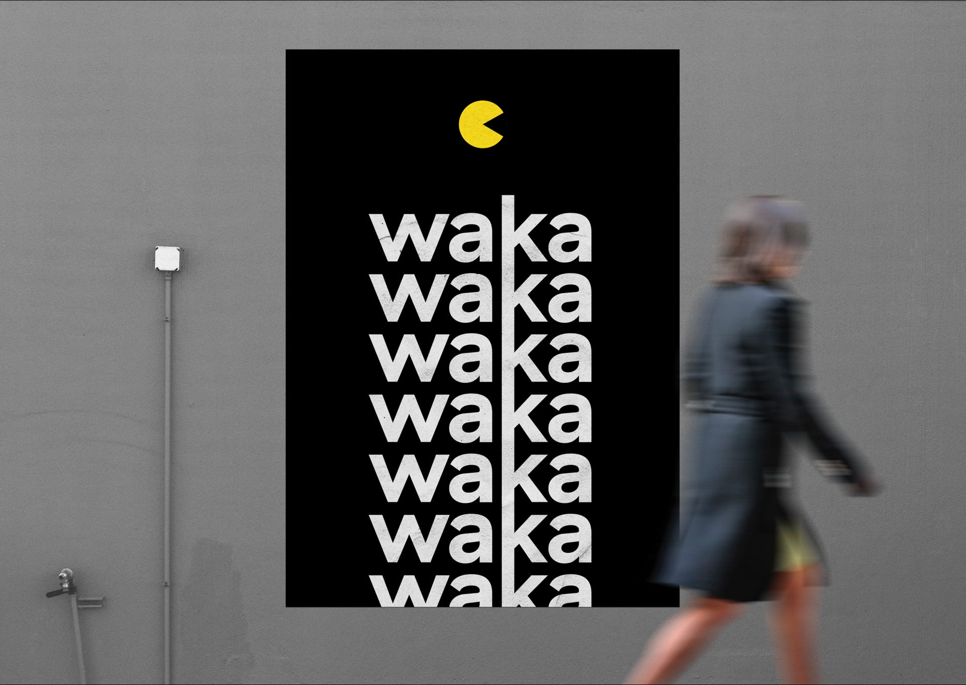
Our visual elements
The 'Beyond Boundaries' pay-off is supported by statements that describe how we make this happen. These statements have been translated into visual and abstract shapes. With the use of these shapes, we put emphasis on the importance of the message when we visually communicate.
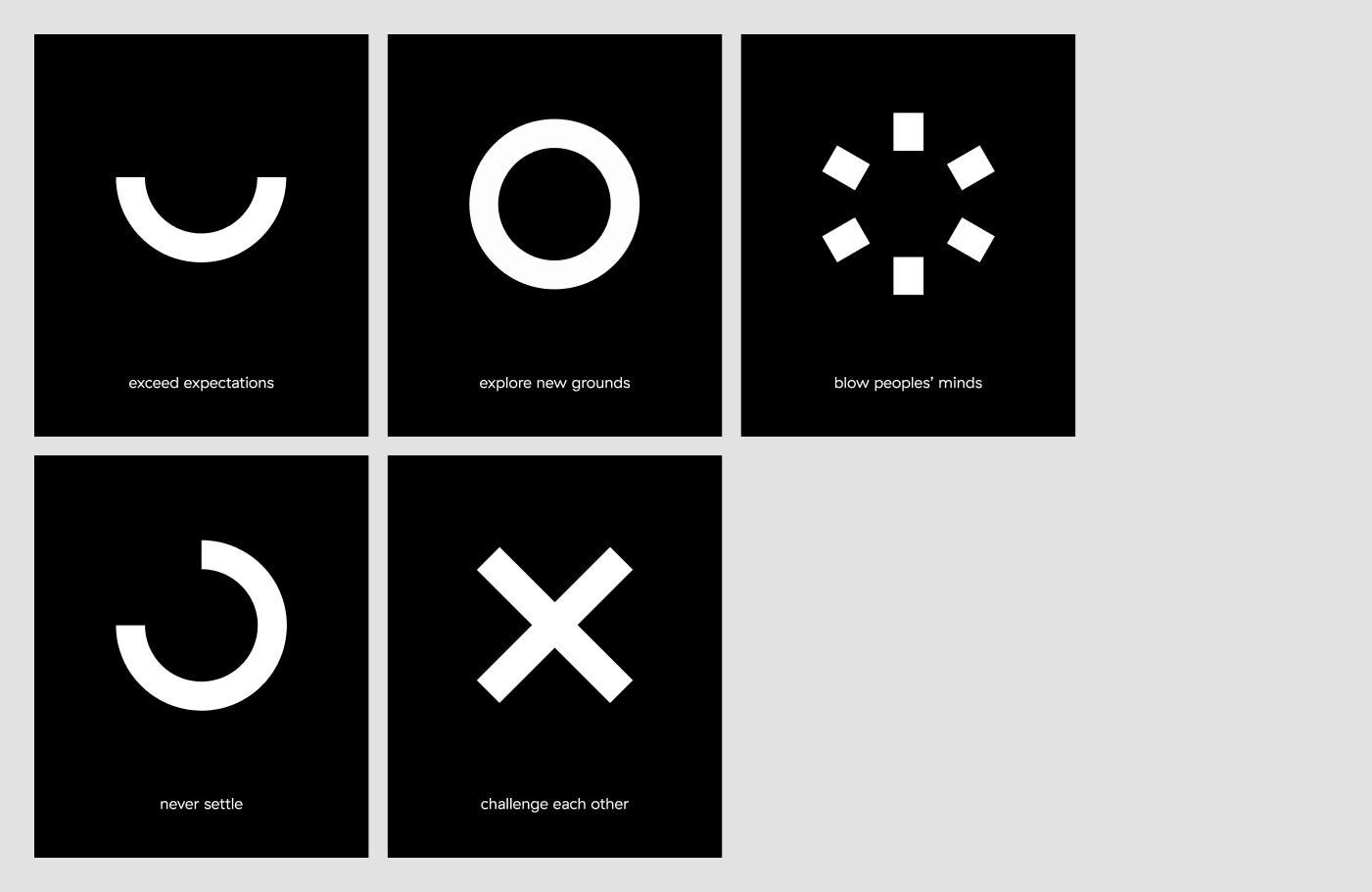
When used in context, this is what they look like.
Our brand in action
Our new website
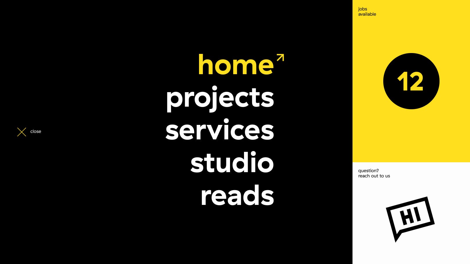
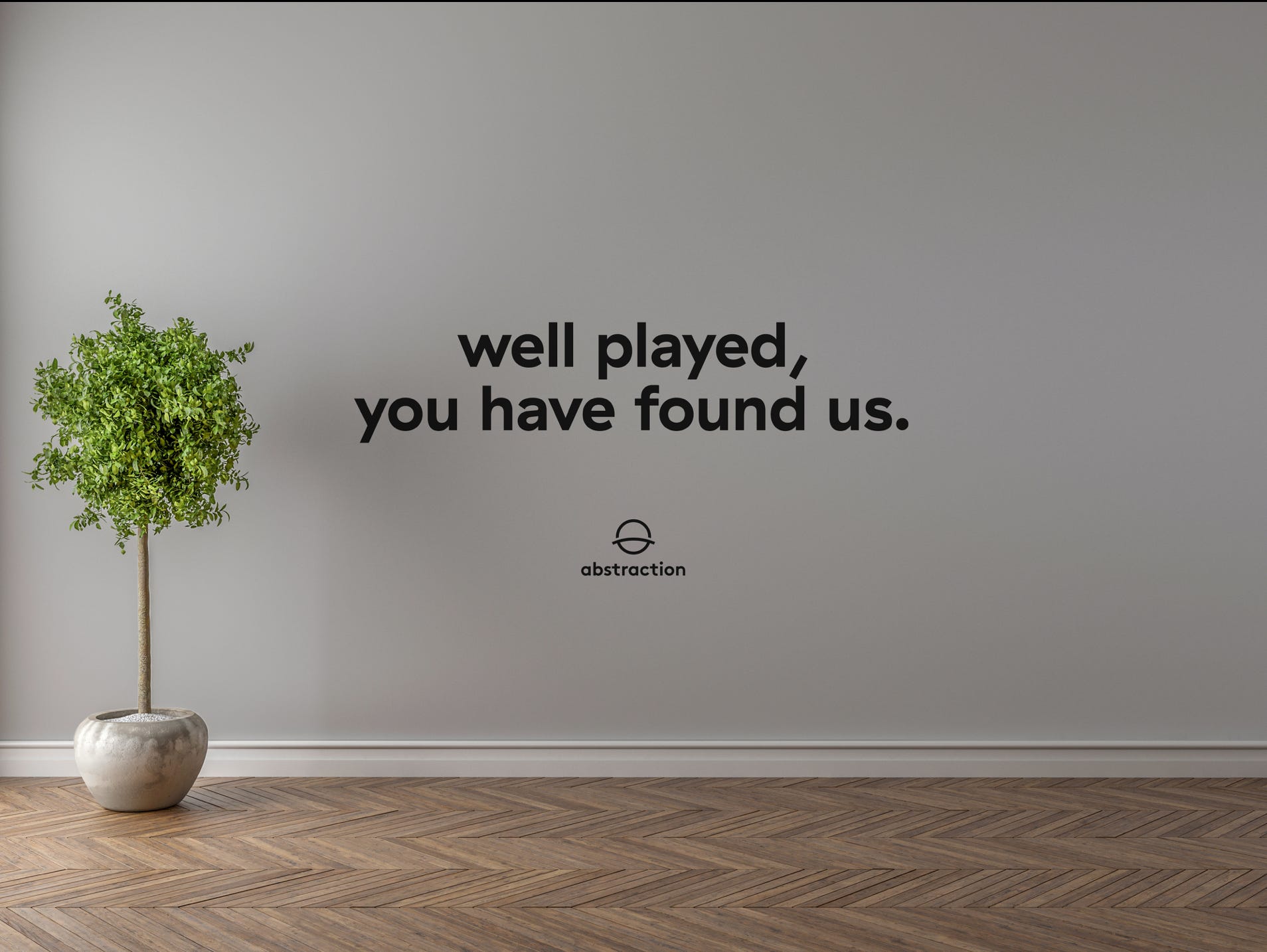
These days, brand experience inevitably passes through the web. Our new website is proof that the web does not have to be static anymore.
Websites are more than a digital business card these days. Technology made that happen. Our new website is packed with innovative goodies, but I'll just let you find that out yourself at www.abstraction.games
We are all very excited about the future. For press inquiries, business collaborations, support or just a quick hello, be sure to get in touch with us.
For more details on Abstraction, check out the new website right here.