An introduction to choosing colors in game VFX
VFX Apprentice shares insight into the thought process that goes into color palettes for impactful visual effects
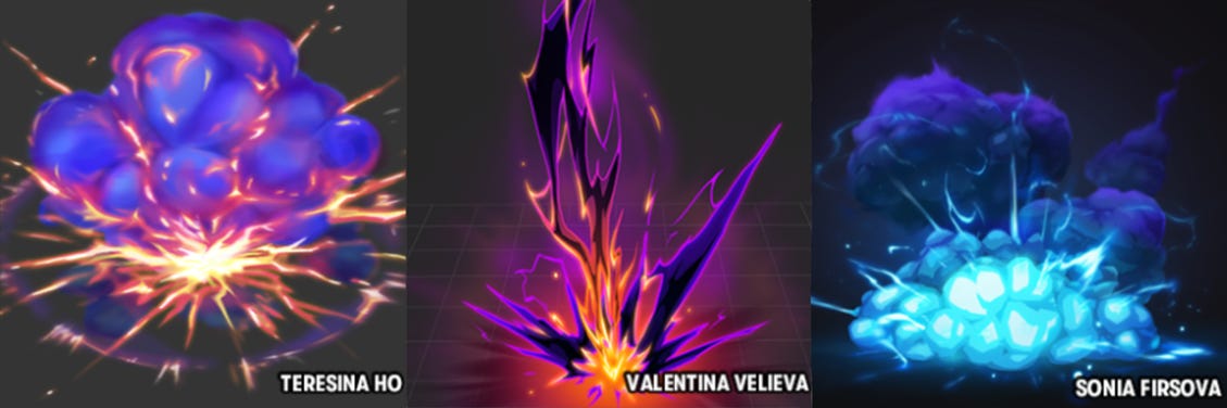
Video game effects are often remarkable for their intense explosions of color and bright, magical appearances. Trying to find that perfect combination of colors for your own effects can be difficult.
We've taken the game FX design pipeline and broken down color into four major tips that you can use to help give your effects extra pop and cohesion.
1. Consider value and energy when choosing color
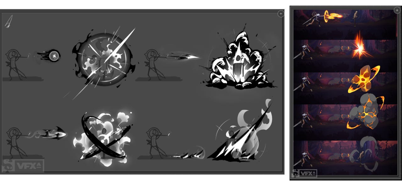
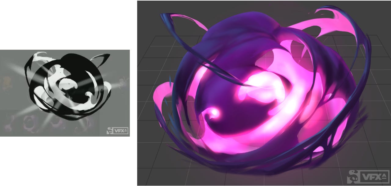
It might feel a little counterintuitive, but one of the best ways to make sure your colors will pop in the long run is actually to start with what might be colloquially considered to be "no color" (ie. grayscale).
Think about what the effect you would like to design is trying to illustrate to the viewer
If you break down what color is, you end up with value, hue, and saturation. Value is one of the must-know principles of VFX. It is how light or dark your color is and, if you work in grayscale, you can see how different elements of an effect will play together before getting too far into the process.
By cutting out hue and saturation at first, you can focus on creating focal points and establishing contrast between elements of your design. This will also help you determine your hues and saturation later on, because you already have value levels defined.
You can even check your values while you're working, with the desaturation option in Photoshop. If you're using Windows, you can even go into 'Ease of Access' color filters settings and turn on grayscale for your entire screen.
Making sure that your effect has noticeable differences between elements can also help with accessibility for all types of colorblindness, because strong value contrast is universally clear.
So how do you even start choosing values to design with? For static art, you might think of light and shadow, but game effects don't just receive light as inert objects, and they often bring their own dynamic lights to a scene. Think about what the effect you would like to design is trying to illustrate to the viewer: is this a tranquil healing AOE sort of ability, or is it a fiery, magical explosion?
Game effects aren't static images; they appear, and move, and fade. Attributes should change over the effect's life, not remain the same
Generally speaking, the part of the effect where there is the most energy, possibly the most damage, is where you will use your brightest, closest to white, values. Elements of the effect which are lower, slower energy, should be darker, closest to black, values.
So for example with an explosion, the burning hot core should be bright, sparks flying off might be a more medium value because there is still energy but it's fading, and smoke rumbling out the bottom should be darker values as there's little energy involved. You want each element of your effect to have some contrast with the element next to it so that it will still be visible as separate down the road.
Then volume and lighting can come into play. For example, a glowing core will put out light, meaning that interior elements to your design should be higher values as well, as they are full of energy. Outer elements would then be darker values, since the light/energy is not hitting it.
It's important to remember that game effects aren't static images; they appear, and move, and fade. Attributes should change over the effect's life, not remain the same from start to finish. This goes for pretty much every attribute of a particle, not just value (ex. alpha and RGB). It can help to break down an effect design concept into multiple phases to help you define these things, so that you can pick values for the burst of energy, and then values for as it fades.
For example, near-white values are often timed for just a few frames as a flash, then subside once damage has passed. Keeping high values around for too long can create unnecessary noise, or make it appear as if an ability is dangerous to a player for longer than it actually is. Your value level should generally translate to an equivalent level of importance.
2. Define major and minor colors
You may already start this as part of working in grayscale, but it will help if you decide early on what color you would like to be your main color, and which will be the support. This also goes for the different elements of your effect. In an explosion with a puff of smoke, what part of the effect is most important? Which is secondary?
Main colors should be the brightest (highest value), and/or the most saturated. Supporting colors should be more subdued, often translucent, to make them blend in with the background.
You can lower the saturation or darken them to make them less vibrant than your main color. In fact, it can be very tempting to fill your effect with too much saturation, as many new VFX artists do. So remember to not go too crazy with saturation levels even in your primary colors.
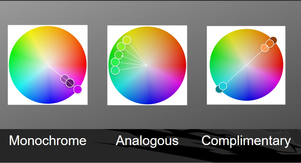
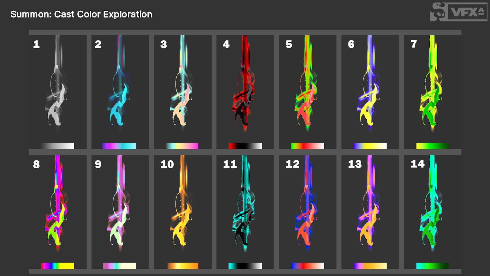
Hue is likely more what non-artists think of when they think of color; and hue relationships play a big part in readability to a player. Your hues can get out of control if not planned up front. For instance, will your fireball be based in oranges or blues? Accidentally blending these two contrasting colors can bring visual noise and dissonance.
Complementary, analogous, monochromatic, and triadic relationships are generally pleasing to the eye. Complementary colors offer contrast, which is more eye-catching but also potentially more distracting. Analogous colors tend to be more natural and calm. Triadic works best when one is a major color and the other two are supporting.
Saturation ends up working much the same as value when it comes to effects, though you can have colors with high saturation and low value or vice versa. High saturation, like high value, draws the eye's attention, while low saturation gives a calmer feel.
However, when it comes to saturation, it's important to keep in mind that having multiple high saturation colors with the same values can clash.
When it comes to choosing your palette, it generally helps to look at your colors by meaning and identity, and then start narrowing down what kind of relationship you want to help you pick from there.
3. Transition color across the effect
As a general rule, a small amount of variation is always better than none. Whether you are varying hue from a blue to a purple, varying opacity or saturation or value, having some amount of variety will draw the eye's attention rather than overlooking it.
Even a monochromatic palette, which might be considered as the "same color" because the hue is the same, has variations in saturation and value.
There is a limit to how much variation is a good thing however. You want your color depth to work across the entire effect composition. In other words, a gradient over an entire effect is better than lots of little gradients. Contrast between colors and elements of your effect should also be used with a purpose, as it will draw the viewer's attention.
4. Explore and experiment with thematics
Color can tell a lot of story, and color palettes can tell even more. It's not a secret that color can evoke emotions, like blue often being somber or red being aggressive, but it doesn't stop there.
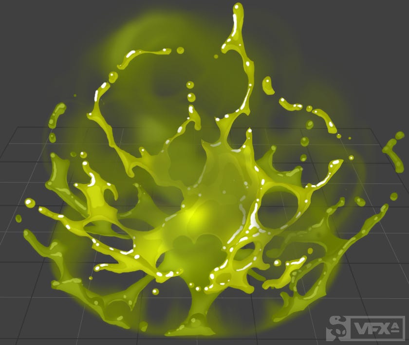
Combinations of colors help illustrate even more complicated sorts of feelings. Consider green for example, usually a sort of peaceful, natural color, especially when used alongside sunshine yellow and river blue. Combine that green with purple on the other hand, and hike up the saturation, and now it's a sickly, poisonous sort of feeling.
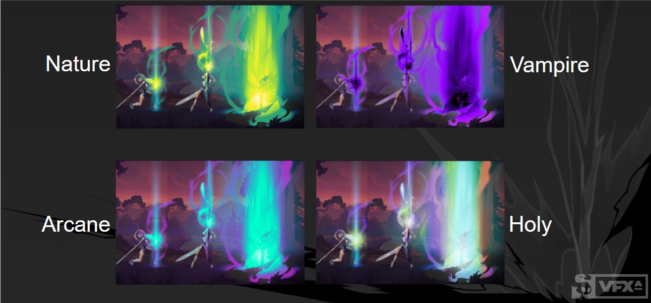
There are lots of existing combinations of colors into palettes like this, where schools of magic across various games and genres have fallen into similar palettes. Fire magic is rarely not some combination of red, orange, and yellow.
This can certainly be a benefit for designing effects, because there's a collective understanding of what these color palettes mean to the average viewer. That said, you don't have to stop with what's known!
Exploring and experimenting with color is never a bad thing, and trying out different combinations can result in all sorts of new ideas. Color swapping an existing effect gives an entirely different feel and from there, could inspire something different than what you had originally planned.
Part of being an FX artist is that you will always be learning new things, so get out there and play around; you never know what you might make.
Jason Keyser is a renowned FX artist, educator, and founder of VFX Apprentice. He has worked in entertainment for 13 years, animating for the Powerpuff Girls, Netflix, and multiple titles for Riot Games. Patty Ruhnke is an enthusiastic digital artist, and copywriter for VFX Apprentice, who loves magic sparkles and bright, colorful visuals.