A crash course in designing clothes in games
Sumo's concept artist Shania Hall share the textile trials and tribulations that come with designing fashion
Every outfit tells a story. Characters aren't just defined by their facial features or physique, a lot of who someone is and what they're about comes from their style and environment.
I'm currently working on asymmetrical third-person horror title The Texas Chain Saw Massacre, based on the iconic film. My role has been primarily in environments and character, and I'm working to bring authenticity to every area of the game – including fashion.
Both at work and in my personal life, I'm fascinated with how clothes can play into the rules of a reality and how a characters' fashion choices are influenced by their environment. From fantasy to the real world, I love working to find solutions and bringing my own passion for fashion into projects I'm working on.
Here, I break down some top tips on creating fashions that fit in the world of your game, some tool hacks to save you time, and advice on how art can reflect real life.
Explore the era
Every world in games exists with its own sense of time and space. From far-off worlds to an earthly era gone by, fashion plays a huge role in giving characters their grounding in the reality they live in. With this in mind, never underestimate the power of research.
Something I've been really focussed on over the last couple is years is authenticity and I've been on a journey to make sure everything players see on screen reflects the real world. In order to do this, research has been crucial.
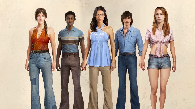
For example, the original film of The Texas Chain Saw Massacre was made over 50 years ago – a fact that has made tracking down behind the scenes photos and more information about materials, furniture and scenery difficult.
Both the film and the game are set in Texas – the USA's fourth hottest state – in a heatwave during a time of economic struggle where political tensions were rife. Characters have to feel lived in and real, so think about how the setting is impacting what they're wearing. In this case: what materials were available? How are they impacted by the heat and the relentless sun of Texas? How are they styling pieces for the time period?
The answer? A lot of Googling, plenty of TV, and hunting for vintage magazines.
When I was brought onto this project, I immediately got stuck in with my research and started to binge-watch countless 1970s TV re-runs, sourcing magazines from the era and Google became my very best friend. I was spending my time discovering websites devoted to ‘the class of 1973' and looking through yearbook photos, family albums and diving into forums of people who lived through that time.
Closer to home, I was able to get a hands-on look at some of the fabrics and how they felt and moved by sourcing photographs of my dad from the 1970s – this gave me the opportunity to ask questions and dive deeper.
Discovering fabrics
When it comes to authenticity, even the smallest details count – from eyelets to thread count. When I embarked on this journey, I never imagined the hours I would spend pouring over Levis's catalogues from the 1970s and the number of articles I would read about denim production.
When creating realistic fabric designs, I'd use 3D software like Blender to create an assortment of different fabric patterns and materials using Blender's Material Nodes. Once I'd reached the desires look, I'd render the material I'd created into a PNG output to overlay it onto my photoshop base.
While some players may never notice the different types of fabrics in a game, it's important to faithfully recreate the way they move, feel, and interact with a character, and how that impacts the gameplay.
Let's talk about jeans for example. The 1970s brought about a huge wave of popularity for denim – from jean jackets to jean shorts, jean shirts and the standard pair of jeans… but which of these would teenagers in 70s Texas be wearing? To find out, I poured over catalogues, teen magazines and Facebook photos and discovered that, basically, they wore everything – the more denim the better.
While some players may never notice the different fabrics, it's important to faithfully recreate the way they move, feel, and interact with a character, and how that impacts gameplay
For creating jeans, you need to work on the basis that all jeans are different cuts, colours and thread counts. Clothes in that era by were made to last and built for years of wear and love, in contrast to modern day fast fashion trends. With this in mind, a lot of jeans made back then were of a ‘higher quality' and therefore have a higher thread count, so you can expect to see characters wearing much smoother-looking garments.
Another interesting fabric I explored was wool, something which has massively evolved over the last 50 years and is now usually replaced with synthetic materials for a cheaper and quicker production.
Wool is a much hardier fabric than more synthetic materials and lasts longer, so any characters wearing a wool product have likely owned it for years so you'll see the presence of more wear and tear. I loved being able to reflect this in my designs, showing every day wear and years of adventures was done by overlaying grime textures on top of the fabrics in photoshop – my favourite to use was wall moss to create a damp look.
The other material I really got to understand was cheesecloth – a hugely popular fabric for the time, especially in southern, warmer states. It was common for teenagers to tie their shirts and expose more skin in the late 1960s, so if a material has been tied and creases easily – what would that look like over time? These are all things to consider when you're working with textiles.
You also have to think about how fabric responds to movement – like running or jumping – and how it would fit on the body when a character is crawling or crouching.
Think outside of the box
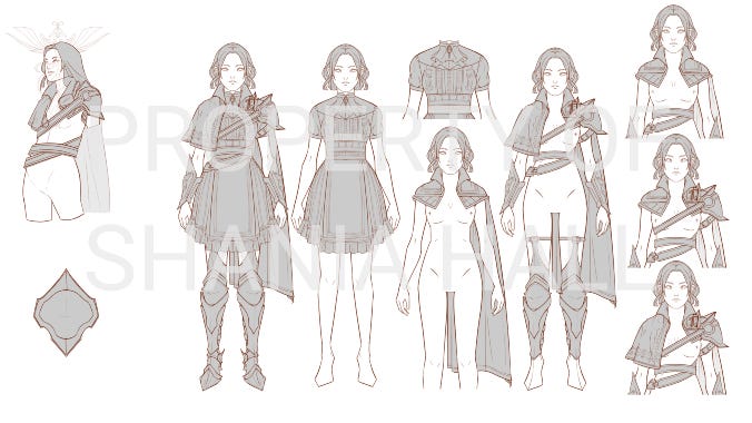
A good exercice to challenge yourself is to test your skills in something completely different – in my case fantasy art – to think about options outside of the boundaries of your setting.
As you can see from my below work, you can really create your own rules when working in fantasy. Using PureRef, I was able to pull all my references both from the real world, from fantasy, and of my own creation, into one place to visualise how the final image would look and could swap out reference pictures for things that weren't working.
This then informed a lot of the styles I developed – the character below is a Vanguard in a castle and I was able to show her rank through armour but give her personality by using Victorian-era dress details beneath.
Working in this way can be incredibly freeing, things don't have to have a ‘why' to them – sometimes huge shoulder pads and a cape can be part of a look just because they look cool.
Concept art in the real world
My role in concept art has really affected the way I see the world – especially when it comes to media. Games, movies, and TV all apply colour and shape theories to their characters.
I'm currently rewatching The OA for the third time and (sorry, spoilers ahead!) throughout the series I've noticed that all characters in purple are ‘good' characters, whereas all those in yellow are ‘bad' – it's subtle enough that you don't really notice at first, but you realise the way they've played with colour theory plays a huge role in the story and is almost like a character itself.
This is something all concept artists can apply to their work – especially when it comes to the way something looks. As humans, we're inherently able to recognise that softer, round shapes are ‘friendly' or ‘good', and things that are more angular are ‘bad' and should be approached with caution. Think of The Lion King – Simba is much more rounded, but Scar is very angular with sharp contours and edges.
Tools of the trade
Through all of this work, I'm always mindful that it takes patience and creativity combined with some very helpful tools, platforms, and readings.
I'm a huge fan of using Blender – it really allows me to bring my work to life and see the progress. I recommend the lighting tutorials, they're really helpful in making concepting within the platform easier.
Working in this way can be incredibly freeing, things don't have to have a 'why' to them
Don't sleep on going analogue! Tech is an amazing thing but I would be lost without my colour-theory books. My favourite is Color and Light: A Guide for the Realist Painter (Volume 2) by James Gurney which examines how light reveals form, the properties of colour and pigments and explores a wide variety of atmospheric effects.
All of my Googling, searching and rabbit-hole diving would have been for nothing if it hadn't had been for Pinterest and PureRef. Inspiration boards allow concept artists to bookmark interesting images, ideas, colours or shapes to come back to later – you never know when you might need them.
ArtStation is also a must for any concept artists… But remember not to get overwhelmed or intimidated by the work you see on there. Concept art is a work in progress and all the scrappy, unfinished and messy parts of it are as important as any beauty pieces you might see out in the world.
Shania Hall has been as an artist at Sumo Nottingham since 2019 and quickly found her feet in concept art.