Pick Up That Can
Human Head's Norm Nazaroff on the problems with interactive objects
Each week we feature the best content from #AltDevBlogADay, a blog site on which developers write daily about things that they find interesting. This week it's the turn of Human Head's Norm Nazaroff.
I'm sure that most of you have already seen the recently released Deus Ex 3 gameplay trailer. One of the game elements highlighted in the footage is Eidos' method of calling out interactive items in the game world: a bold, bright yellow outline and highlight over anything you can interact with that's more or less in the direction the player is looking.
Some of the fan reactions to the trailer have been quite surprising, with a few gamers going so far as to call themselves "outraged." They don't like having information in their face, and what's more they seem to find the assertion that they need to be vaguely condescending. Some folks have even brought out the dreaded "immersion breaking" phrase. All this fuss over some simple object highlighting! Clearly, most modern games need some way of pointing out what is and isn't relevant to help streamline gameplay, so what's the big deal with Deus Ex's method?
Framing the issue
First, let's note that there are actually two different problems to address when it comes to interactive objects in modern games:
- Showing the player objects that can be used, picked up or manipulated.
- Indicating to the player which objects are actually important at this moment.
The concepts are similar but, importantly, the second problem is really a subset of the first. Further, the degree to which these two things differ (that is, how much of the former problem the latter encompasses) can vary a great deal between games. We can indicate the general range of this with the Internet's favorite tool: a two-axis graph.
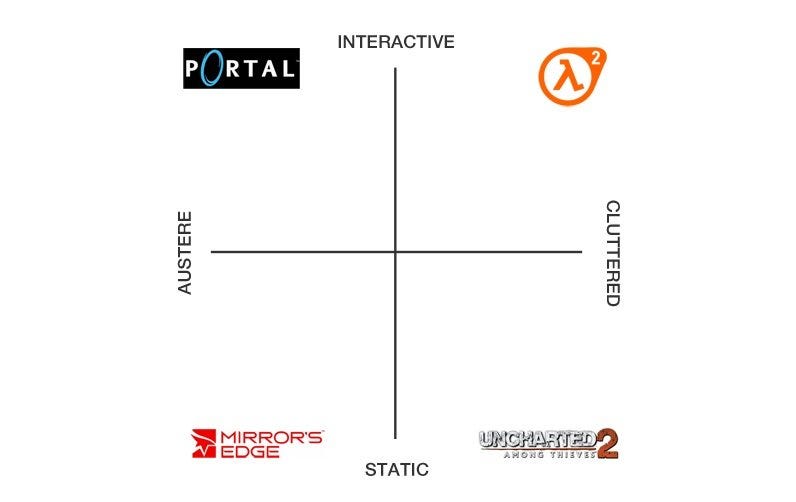
I've taken the liberty of inserting what I feel are four representative examples, one for each quadrant. I should emphasise that this graph does not assume any sort of value judgments. No quadrant is any better or worse than the others, it's just a simplified way of quantifying our options.
Fleshing out the axes
Valve Software's Portal gets categorised as both austere and interactive. Excepting the latter third of the game, there isn't a lot of stuff sitting around in the Aperture Science testing grounds. This is not a game that focuses on props, but what is included is almost all interactive: auto-turrets that will attack you and can be knocked over; cubes to pick up and moved around; giant red buttons to press; bouncing energy spheres to re-direct. We have Spartan environments combined with highly interactive game objects.
Mirror's Edge sits at the intersection of austere and static. Though not nearly as focused as Portal, the level design of Mirror's Edge is still beautifully direct. There are some props around to give the world flavor – piles of boxes on pallets, wooden planks to indicate good jump points; the occasional planter box or advertisement – but very few of these objects are meant to be interacted with. You'll sometimes find a wheel that needs to be rotated or an enemy weapon that can be picked up, but that's pretty much the extent of what you need to manipulate in the game.
Sticking with static but moving along the horizontal axis toward cluttered we have Uncharted 2. This game has some of the most striking environments in this generation (not to mention being one of my personal favorites) and they're filled to the brim with stuff. In particular, the Nepal level is practically overflowing with props: burned out cars; piles of rubble and trash; orphaned furniture and appliances; plastic crates and other detritus of a city in conflict. For the most part, though, these things are there purely for purposes of immersion. It's fairly rare that you need to actually manipulate part of the environment, and these are mostly limited to either cinematic moments (such as bits of train car that start to break as you climb on them) or navigation elements like ropes and doors.