Best practices for designing an effective user interface
Double Eleven's Edd Coates shares the essential components to designing accessible and effective UI for video games

The relationship between game and player is a two way street. The information a game presents, and how the player interacts with that information, are key components in making gameplay an intuitive, smooth, and painless experience.
Depending on genre, theme, and style, this can be done in myriad different ways, but effective User Interface design -- that is, how the game gives the player access to the necessary information on screen, and how it layers it all through User Experience -- has some baseline rules that can turn your UI from good to great. No matter the game you're making, there are ways your UI can blend seamlessly into player experience.
"Look at your references, look at other games that have done something you're trying to do"
Edd Coates is the senior UI artist at Double Eleven, which recently developed Minecraft Dungeons. Speaking to GamesIndustry.biz, Coates went through some of the key considerations developers need to be aware of to make sure their UI and UX are effective, work in tandem, and never hold back the player from experiencing the game as intended.
It's also worth noting that Coates recently created the Game UI Database, a website dedicated to cataloguing, via an extensive number of screenshots, how different games use UI to present the hierarchy of information the player needs to know. You can search for games individually, or go through the filters for genre, UI type, and specific UI information like title screen or heads-up-display.
As a resource, this database acts as the perfect companion tool for the lessons and essentials that Coates walks me through during our conversation about how to create an effective user interface.
Use design patterns that other developers have iterated on
What Coates makes clear from the outset is that you ideas are not unique. There are plenty of games that have explored the genres and themes that you aim to explore as well. You should use other games' UI as inspiration for your own, as those successes can inform your design decisions.

The continual development of UI has created what Coates calls "design patterns." These patterns exist because, over time, through an almost collaborative effort, designers have figured out what works for the type of game they're trying to make.
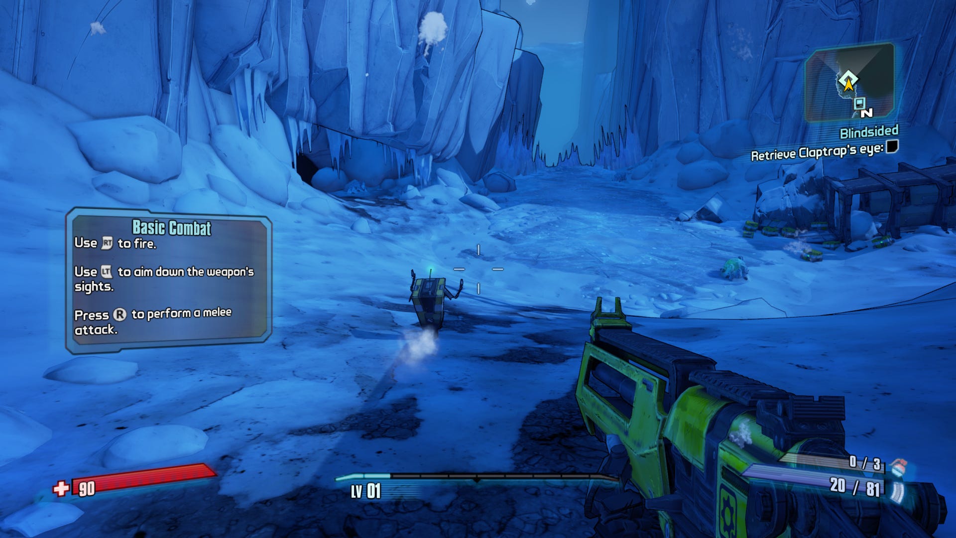
"You get an idea of what to do by looking at games in the same genre," Coates says. "If you have something like a first-person shooter for example, it's established that health will be on the bottom of the screen. The reason for that is that loads of other games have done it. That's literally it -- that's what people expect."
- Understand the history of your desired UI
If your research leads you to realise that there's certain UI and UX conventions for the genre you're in, incorporating them will help players familiar with that type of game understand what the UI is communicating, with very little external effort.
For example, red is the colour that commonly refers to player hit points. If you decided to use green to represent health in the UI, that could confuse players in the most crucial moments. It comes down to having a good understanding of the genre, and the tropes within that genre.
"UX would be more tied to the genre of the game, whereas the UI would be tied to the theme of the game," Coates explains. "Say I was looking to make an RPG, I'd look at how [other RPGs] do inventories, menu selections, equipment, and focus on how other games do the functionality of those screens.
"Then for UI, I'd look into theme. Say you've got a pirate-themed RPG -- I'd see how all pirate themed games approach the aesthetic and see what I can take from that."
This is where the Game UI Database really shines, because it acts as an easily searchable encyclopaedia for this lesson. You can build up plenty of resources to help dictate a baseline for your UX's usability and your UI's aesthetic. Coates does encourage you to try and break conventions if you feel like it though, because that can lead to some entirely new results in UI.
- Use wireframing to decide on the placement of UI elements
Once you've got some design patterns considered, and maybe even a general aesthetic -- although at this point that isn't necessary, as the usability of your UI comes first -- you then need to think about information placement. This comes from wireframing.
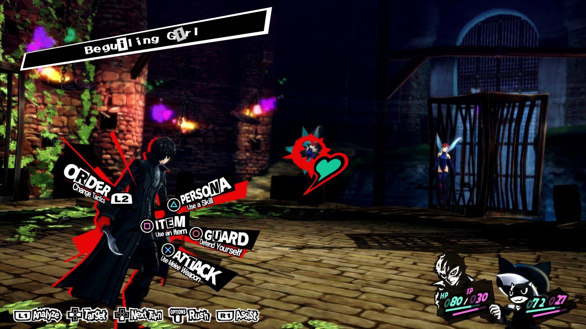
Wireframing is where you create a greyscale diagram of what you want the UI to look like. In Persona 5, Coates says, the placement and shape of each UI element would have been worked out with wireframes, before the addition of any colour or style.
"They would focus on the placement, and maybe on the shapes, but they don't focus on colour. So they focus entirely on contrast, greyscale shapes and layout. Those are the core fundamentals of your UI and UX. Only once that stuff is then done, can you move on to making it look pretty."
As a process, you need to first understand what genre and themes you're working in, and use that to define the design patterns you can use. Then it comes down to placing those ideas into a wireframe structure, where the aesthetics and flavour can then be injected into the UI.
As Coates puts it: "Take the wireframe from the genre, and marry it with the UI from the theme."
Anticipate how the player will interact with your UI
When designing UI, you need to make sure you're always thinking like the player. In the most basic sense this means having people play your game, use the UI, and evaluate their experience after the fact.
While there are plenty of smaller ways to anticipate the player through UI functionality, Coates outlines how you should take away any amount of guesswork on the player's part. Communication should be clear and concise.
- Place UI elements into a hierarchy of importance
"You should anticipate what the player is going to want to know, and what they're going to want to see.
"For example when you go into an inventory screen, the star of the show would, and should, be the inventory -- the grid with all the icons. Second to that might be the controls, telling players how to navigate it. Descriptions can also be there, but you've got to ask: are the descriptions necessary or just flavour text?"
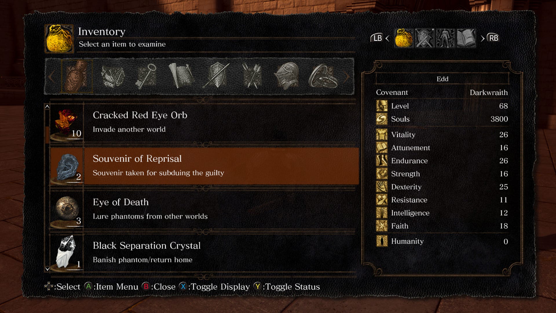
Coates uses the inventory in Dark Souls as an example, where the inventory is just a grid, with the controls at the bottom. You only get the lore of the item when you select it, so having it hidden behind a sub-menu creates a hierarchy of information. FromSoftware has anticipated what is most important to the player in the context of the inventory screen.
Anticipating the hierarchy of information in every screen of the UI is essential. Coates says that gating off information is an effective way of establishing a hierarchy, but there are other techniques you can use.
"You can draw attention to something by reducing the things around it. The bad way to do that is with loads of buttons and arrows, or something similar, as it makes the screen cluttered. The good way reduces the UI around what you want the player to interact with, as it naturally draws their eyes to what you want them to click.
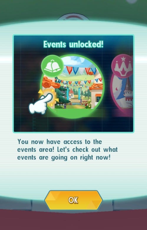
"Free-to-play games do this really well, they've got it down to a fine art. They'll basically remove half the game through UI until you've got to that bit of the tutorial. Pokémon Masters EX looks deceptively simple when you boot it up. It doesn't want to intimidate the player, but the more you play more features come in."
Removing UI elements entirely until the first time they're needed can be done in different ways, but serves the same purpose of not cluttering the screen and overwhelming the player.
- Use animation in your UI
Motion and animation can be used in plenty of ways to support your UI, like enhancing its visual design, to make the game feel more "alive" and to draw the player's attention to specific elements, Coates says.
"A static screen can be visually uninteresting, and might even give the impression that the game has crashed. Whether it's a subtle pulse effect, a flickering vignette, or a moving backdrop, just adding a tiny bit of animation to a screen can make a game look more polished and appealing.
"For example, the monitors in Metro Exodus use distortion effects and a rolling bar that combine with the scanline textures and art style to make them feel more retro."
With all that said, the animations you might choose to incorporate shouldn't overshadow the functionality of the UI itself. Coates says that you should still guide the player through the UI, and make sure it's understandable.
"There should be a path that the players' eyes follow. They should look at the interface, then the information, then the menu options.
"You want to give your UI room to breathe, you want the text to be readable. Then the player knows where to look."
- Ask the right questions
The last major aspect of anticipating how the players will navigate your UI comes from how you interact with the people testing your UI. Coates says that asking players about icon design is essential, because while a floppy disc might mean 'saving' to you, it may not to most of your audience.
"Don't ask loaded questions like 'do you like this?' Or 'am I doing okay?' You want to ask them what they think the UI means to show, what do they expect to happen when they press certain buttons."
Make sure that you ask about how their experience with the UI went -- did they assume something at any point but meet the opposite outcome? Like the age old question of whether subtitle configuration should be in audio or video settings?
Never assume when talking to play testers -- always keep in mind that their experience with the UI is the most important thing.
Think about the UI's role in your game's aesthetic
In any sort of user interface, part of the challenge developers face is designing something that the user enjoys engaging with. This goes beyond a UI being functional, and requires a UI to be memorable because of its artistic merit.
Unity assets or a barebones UI aren't a bad thing, necessarily, but if treated right the UI in itself can elevate the whole game.
The example Coates comes back to is Persona 5, which has an incredibly bright and distinctive UI that almost pops out of the screen. The UI is the immediate point players are drawn to. He says that the UI has so much power that can be harnessed in helping to create the entire identity of your game.
"If you just invest in a really good UI you can transform that game and really make it sing."
- Find a balance between the game world and the UI
The same can be said of the inverse too. If you have a game world that is the epicentre of everything, like Breath of the Wild, you don't want the UI to get in the way. It should be functional, but not distracting.
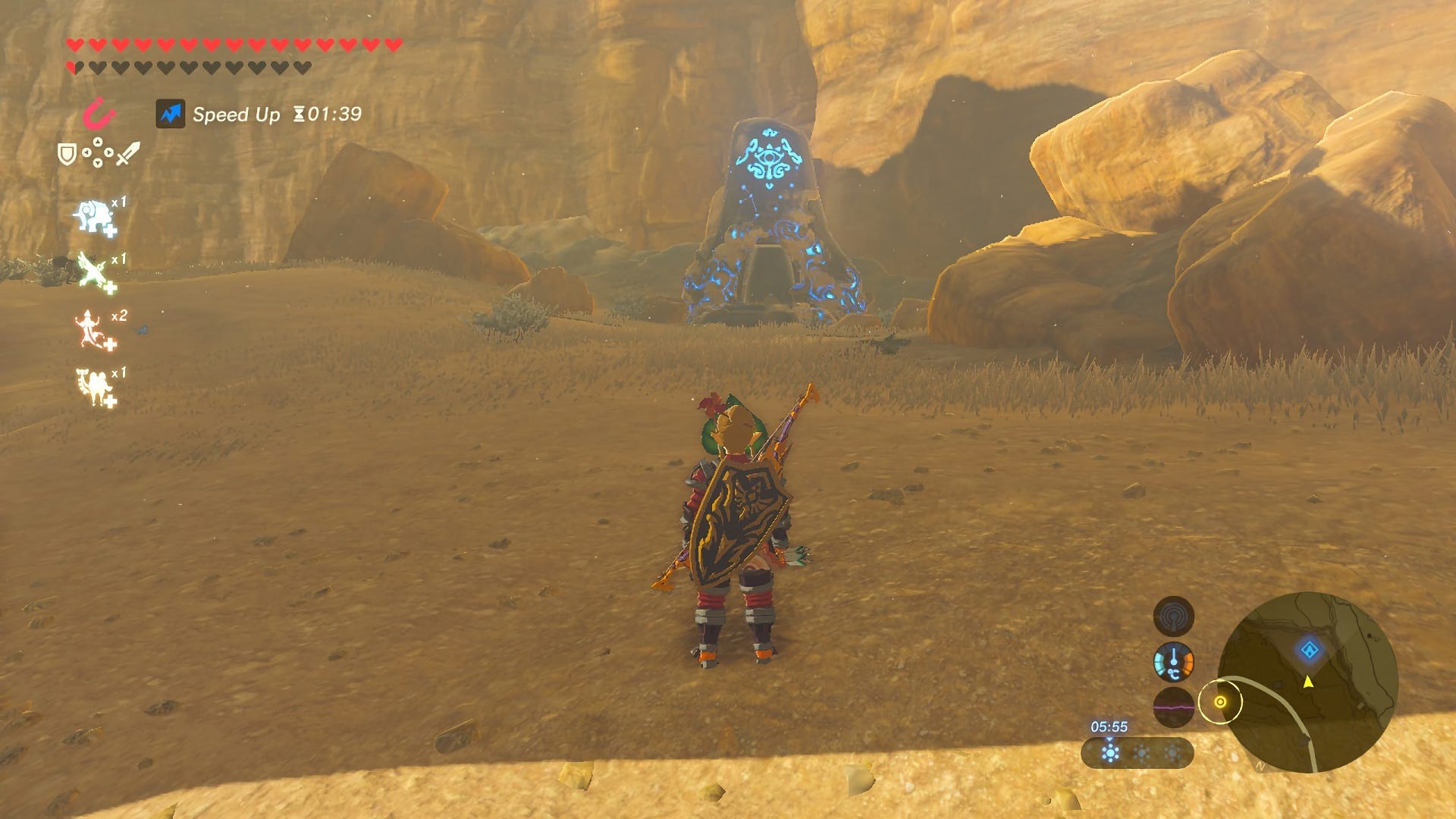
"It depends on what you're going for -- you can show as much or as little of the UI as you want," Coates says. "What it really comes down to is what information does the player need to know right now."
Coates adds that you should never focus entirely on the game world and neglect the UI, but you can integrate them by making the UI diegetic. He refers to Dead Space, and how that game seamlessly integrated its UI with the world to better immerse the player.
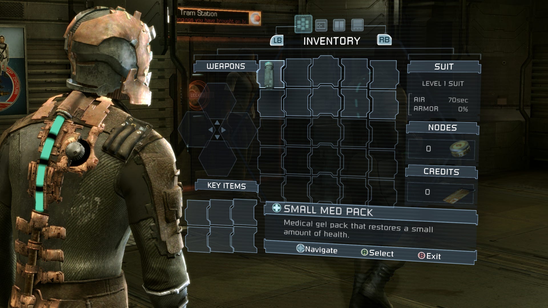
With diegetic design, you should only break the immersive nature of the UI when you absolutely have to -- through the pause menu or title screen, for example -- because otherwise the diegetic design is spoiled by having the player repeatedly removed from experience.
Coates emphasises that UI is a complex beast that's very dependent on context. The genre, theme, style, and key information a game needs to present all dictate the fundamentals of your UI design. That doesn't mean you can't try something new, but careful consideration need to be paid to the layout of the UI before you look at visuals.
"Look at your references, look at other games that have done something you're trying to do. That's the surefire way of knowing if something is going to work. If you are doing something brand new, then you want to prototype it, test it, ask people for lots of opinions on it.
"You want to make it [the UI] intuitive. That's really the most important thing. Without that your UI is useless, broken."