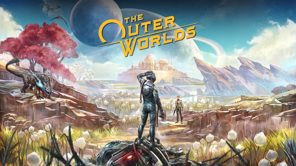
Exploring new frontiers of color with The Outer Worlds
Art director Daniel Alpert discusses the visually striking approach to Obsidian's latest RPG

There's reason to believe games have a bright future. Well, brightly colored at the very least.
Speaking with GamesIndustry.biz recently, Obsidian Entertainment's Daniel Alpert makes an observation about why game developers may feel increasingly comfortable releasing visually vibrant titles like The Outer Worlds, the single-player role-playing game for which he served as art director.
"Games tend to reflect the current state of film, and film tends to have very toned-back color palettes," Alpert says. "They're also known as 'filmic' looks, where the darks aren't necessarily pitch black or the whites aren't necessarily pitch white, and the colors tend to blend with each other. And a lot of games echo that filmic look. That said, there are a lot of movies coming out recently that have started to explore color in a lot more interesting ways. For example, Guardians of the Galaxy started playing with really vibrant tones and colors."
While there's a clear history of games drawing inspiration from film, Alpert notes that both the blockbuster film industry and game development are driven by cutting-edge technology, so they'll echo each other in a lot of ways. That said, he does believe the popularity of colorful films in recent years has primed audiences to appreciate more varied treatments in the games they play.
"Some people will be drawn to the vibrancy of our world and some people will want to explore it just because of how it looks different from the rest of the games on the shelves"
"What's great is that just like no two films are 100% alike, no two games are 100% alike. Some people will be drawn to the vibrancy of our world and some people will want to explore it just because of how it looks different from the rest of the games on the shelves."
It's coming up on six years since Guardians of the Galaxy came out, so there's been a full AAA development cycle or two for its influence to have manifested in games. Players might be able to see a bit of it in The Outer Worlds, from its misfit crew of planet-hopping protagonists to its noticeably colorful galaxy.
While the look of the game may be the first thing that stands out about The Outer Worlds for players, it was not the first thing about the game to come together. Alpert says that before he joined the project, game directors Tim Cain and Leonard Boyarsky had been crafting the world for about three months. When he was brought on board, the premise Cain and Boyarsky gave him didn't revolve around its looks.
"[They told me] it's going back to a bunch of RPG roots where it's a player's-choice-heavy narrative, but at the same time we wanted to play with the idea of colonization of space," Alpert says. "You weren't going to a world that's been there more than a thousand years. You were almost starting brand new in this new world, so how would people react within that world?
"Right away when I started hearing that, I pretty much had Western tones -- The Old West -- in my head. Ok, we're going to be a frontier kind of space colony, so why don't we play with what we know as a frontier landscape and put that into the world? With that, we pretty much set the groundwork of what we wanted."
Beyond that, Alpert says Boyarsky was keen on having a strong element of heavy machinery in the visuals as well. The game's vibrant color palette was not yet a part of the plan.
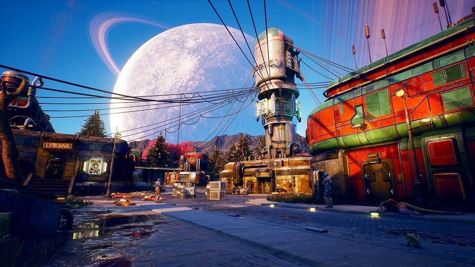
"Then as the story developed and started becoming more and more about corporations and their holds on these frontier towns, we started playing also with the idea that it's not just a frontier town, but a frontier town versus a big city kind of feeling," Alpert says. "And that's when we started introducing the Art Nouveau aspect, showing Art Nouveau as this almost elitist city view while the frontier art is this really down-to-earth style."
Alpert says that's the point where The Outer Worlds started to incorporate a lot more color, combining the "heavy industrial feel" that Boyarsky was fond of with the color palettes common among Art Nouveau advertisements. Alpert said the development team spent a lot of time looking at the work of artists like Czech painter Alphonse Mucha and even modern artists like Moebius.
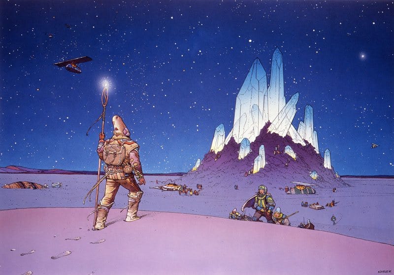
"Moebius was really interesting because a lot of his color palette in his graphic novels echoed a lot of the Mucha paintings. So we had these sources of actually very vibrant, colorful images, and it almost became a bit of a no-brainer for me to start playing with these colors, especially because we had to deal with these corporations and their branding. It was a good way to distinguish one brand from the next."
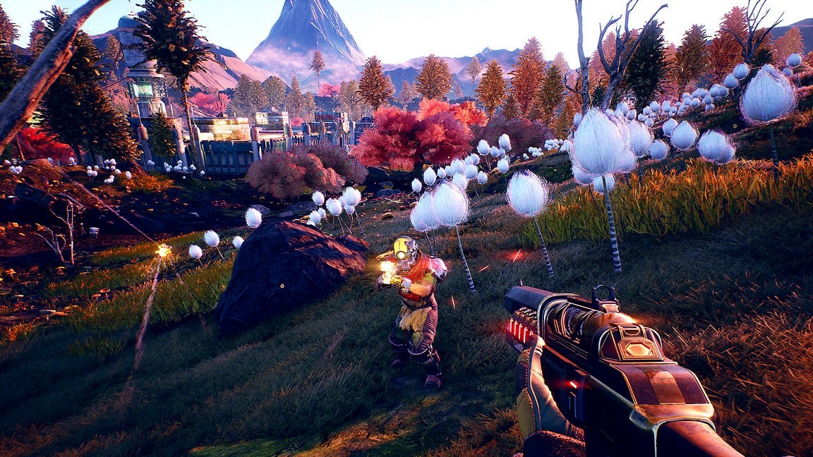
That wasn't the only reason for The Outer Worlds' use of color. Alpert said playing with colors helped to make the game feel a little bit more unusual and alien to players.
"One of the things with The Outer Worlds is we wanted it to feel familiar, but also slightly different," Alpert says. "So instead of a blue sky, I might add tones of green in there just to make it feel a little bit more alien. And some of those things are what keep pushing the color to these abnormal bounds."
"One of the things with The Outer Worlds is we wanted it to feel familiar, but also slightly different"
Sometimes that pushing was closer to a cautious nudge than a forceful shove. Alpert says one of the challenges of playing so much with the color of The Outer Worlds was making it striking in the right way.
"You can definitely push the vibrancy so much that it's offputting for other people. And there are probably aspects of the game where I might have gone too far, but I'm still happy with them. At the same time, one of the greatest challenges is with Tim, who happens to be color-blind. It was my goal not only to push color, but also to push a wide tone palette so he was able to discern the differences and the treatments of the world."
So how did Alpert know when the team had pushed the color enveloper a bit too far?
"You have to listen to people who play your game and listen to all the feedback," he says. "There are people who absolutely love it, and there are people who don't love it as much. But you take that with a grain of salt; I'm still very happy with where we did push it."
Alpert agrees The Outer Worlds is probably the most colorful game he's worked on in a career that spans games like Neverwinter Nights 2, Fallout: New Vegas, and Alpha Protocol. And while he doesn't know quite where that career trajectory will take him next, it's a safe bet it will look decidedly different.
"I'm always interested in seeing what is new and how we can push things to something that feels fresh and at the same time vital," Alpert says.